Minimalist Design: Why Less Is Often More in Products
There's a moment every designer eventually faces: staring at a product loaded with features, wondering whether adding one more option will help users or quietly break something. More often than not, the answer is to remove, not add. Minimalist design isn't a stylistic preference — it's a strategic decision about what a product genuinely needs to do its job.
What Minimalist Design Actually Means (Beyond Aesthetics)
Minimalist design in product development is the deliberate practice of reducing a product to its essential elements — removing everything that doesn't serve the core function. It's a philosophy of intentionality, not emptiness.
Most people associate minimalism with white walls and sparse interiors. In product design, the concept runs deeper. A minimalist product isn't necessarily one with fewer physical parts — it's one where every element earns its place. A button exists because it must. A curve exists because it aids grip or signals function. Nothing is decorative by accident.
The principle traces back to the modernist movement and gained sharp definition through designers like Dieter Rams, whose "10 Principles of Good Design" remain a foundational reference in the field. His assertion that good design is "as little design as possible" wasn't a call for bareness — it was a call for precision. Rams believed that unnecessary elements compete with the product's purpose, diluting clarity rather than adding value.
This distinction matters because it separates minimalism from mere simplicity. A product can look complex and still be minimalist in philosophy — if every element is purposeful. Conversely, a stripped-down product can fail minimalism entirely if removing features created confusion or friction.
The Psychology Behind Simplicity — Cognitive Load and Decision Fatigue
The human brain responds better to simpler products because fewer choices and visual stimuli reduce cognitive load — the mental effort required to process information and make decisions. When a product demands less thinking, users feel more capable and satisfied.
Cognitive load theory, developed by educational psychologist John Sweller, explains that working memory has strict limits. When a product interface or physical form presents too many simultaneous inputs — buttons, labels, options, textures — the brain must work harder just to understand what's available. That effort is friction, and friction erodes the user experience before a single task is completed.
Decision fatigue compounds the problem. Research on consumer behavior consistently shows that more options don't lead to better decisions — they lead to paralysis, regret, or avoidance. A remote control with 60 buttons isn't more powerful in the hands of a typical user; it's more intimidating. The user defaults to the three buttons they recognize and ignores the rest.
Minimalist product design short-circuits this problem by making the right action obvious. When there are fewer choices, each choice carries more clarity. Users build confidence faster, make fewer errors, and associate the product with ease rather than effort. That psychological response is a measurable competitive advantage — not just a design preference.
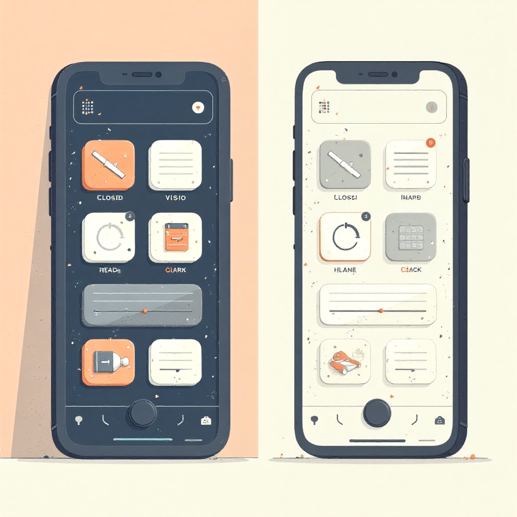
Core Principles That Guide Minimalist Product Design
Minimalist product design rests on a small set of principles that, applied consistently, produce work that feels inevitable rather than arbitrary.
Form Follows Function
Coined by architect Louis Sullivan and later embraced across industrial design, form follows function means a product's shape should emerge from what it needs to do — not from stylistic ambition. When form and function align, the product communicates its purpose without instruction. A well-designed handle tells your hand exactly how to hold it.
Intentionality in Every Decision
Every element — color, texture, weight, control placement — should be the result of a deliberate question: does this serve the user? Intentionality isn't about minimizing effort in design; it's about maximizing scrutiny. Removing a feature requires as much thought as adding one, sometimes more.
Negative Space as an Active Element
Negative space — the empty area around and between elements — is not wasted space. In product design, it provides visual breathing room, directs attention, and signals quality. Products that use negative space confidently tend to feel premium, even when material costs are comparable to busier alternatives.
Material Reduction with Purpose
Minimalism intersects with sustainability through material reduction. Using fewer materials, fewer components, and fewer surface treatments doesn't just lower production costs — it often produces a more durable, repairable, and environmentally responsible product. This is increasingly relevant as designers and brands face pressure to reduce waste across the product lifecycle.
Where Minimalism Wins — Product Categories That Benefit Most
Minimalist design delivers the strongest results in categories where clarity of use, emotional resonance, or daily interaction frequency is high.
Consumer electronics are the most visible example. The shift from devices covered in ports, buttons, and vents to cleaner, fewer-surface designs reflects both aesthetic preference and genuine usability gains. When a device's physical form stops competing with its screen, the screen wins — and the user benefits.
Hand tools offer a less glamorous but equally instructive case. A well-balanced, single-material handle with no unnecessary grip textures or branding embossments often outperforms a "feature-rich" alternative in comfort and longevity. The reduction is the feature.
Furniture design has long demonstrated minimalism's commercial viability. Pieces with clean lines, exposed joinery, and honest materials command premium prices not despite their simplicity but because of it. The absence of ornament signals confidence in craftsmanship.
In concept invention — the space where new product ideas are developed before full production — minimalism is particularly powerful. Stripping a concept to its essential mechanism forces inventors to validate whether the core idea is strong enough to stand alone. Many breakthrough concepts fail not because the idea was bad, but because it was buried under features added to justify the product's existence.
The Design Process — How to Strip a Product Down Without Losing Value
Effective minimalism requires a structured process for deciding what stays and what goes. The goal isn't to remove as much as possible — it's to identify what's load-bearing and protect it ruthlessly.
A practical approach starts with use-case mapping: documenting every scenario in which the product will be used, by whom, and under what conditions. Features that only serve edge cases — rare users or unusual contexts — become candidates for removal or optional add-ons rather than core inclusions.
Next comes hierarchy testing. If you had to remove one element, which would cause the least damage? Repeat that question until only the irreducible core remains. What survives this process is the product's true identity. Everything else is negotiable.
Prototype testing with real users accelerates this. People consistently reveal which features they actually use versus which they assumed they'd want. The gap between anticipated and actual behavior is where most unnecessary complexity hides. Observing a user ignore a feature three times in a row is stronger evidence than any survey.
The honest challenge here is organizational: internal stakeholders often advocate for features because removing them feels like admitting the feature was never needed. Good design leadership creates permission to subtract — treating removal as a sign of maturity, not failure.
When Less Becomes Too Little — The Limits of Minimalism
Minimalism can harm a product when reduction removes functionality users genuinely need, or when it creates an experience that feels cold, incomplete, or untrustworthy. Not every product benefits from stripping down.
Medical devices offer a clear counterexample. A device that monitors multiple vital signs needs to display multiple data points — removing information to achieve visual cleanliness could delay critical decisions. Here, the user's need for completeness outweighs the cognitive benefits of reduction.
Safety-critical products face similar constraints. A power tool with fewer controls may look cleaner, but if removing a guard or indicator light introduces risk, the minimalist logic collapses. Function isn't just about primary use — it includes protection from misuse.
There's also a trust dimension. Some users interpret sparse design as a lack of capability. A professional-grade software tool with a minimal interface may be dismissed by buyers who equate visible complexity with power. In these cases, the design challenge is to achieve minimalism in experience while preserving visible signals of capability — a harder balance to strike, but not an impossible one.
The honest framing is this: minimalism is a tool, not a doctrine. Choosing it for a product should be a reasoned decision based on user needs, context, and function — not an aesthetic default applied regardless of fit.
Minimalism as a Driver of Concept Innovation
Some of the most compelling product concepts emerge directly from minimalist thinking — not as a visual style, but as a constraint that forces genuine invention.
When designers commit to solving a problem with fewer parts, less material, or a single interaction point, they're forced to find solutions that are inherently more elegant. The constraint eliminates the easy path of adding a feature to paper over a design flaw. What remains must actually work.
This is where concept invention and minimalist philosophy converge most productively. A concept that can be described in one sentence — and built with one mechanism — is almost always stronger than one requiring a paragraph of explanation. Clarity of concept predicts clarity of execution.
Consider how constraint-driven design has produced genuinely new product categories: single-material objects that serve multiple functions, packaging that becomes the product, tools that eliminate the need for a separate tool entirely. These aren't minimalist because they look spare — they're minimalist because the thinking that produced them refused to accept unnecessary complexity as a solution.
For designers working in the concept space, minimalism offers a useful filter: if the idea requires six features to be viable, it may not yet be a strong enough idea. Strip it back. Find the version that works with two features. That version is usually the one worth developing.
Frequently Asked Questions
Is minimalist design only about visual appearance?
No. Visual simplicity is one outcome of minimalist design, but the philosophy operates at the level of function, interaction, and decision-making. A product can look visually complex and still embody minimalist principles if every element serves a clear purpose.
Does minimalist design make products more expensive to produce?
Not necessarily — and often the opposite. Material reduction and fewer components can lower production costs significantly. Where minimalist products do cost more, it's usually because achieving simplicity requires more precise manufacturing tolerances or higher-quality materials to compensate for the absence of decorative elements that might otherwise hide imperfections.
How do designers decide what features to remove from a product?
The most reliable method is observational user testing combined with use-case analysis. Designers track which features users actually engage with versus which they ignore, then apply a hierarchy test: removing elements in order of least impact until only the essential core remains. Features that survive this process stay; the rest are cut or made optional.
Can minimalism work for complex or technical products?
Yes, but the approach shifts. For technically complex products, minimalism applies to the interface and interaction layer rather than the underlying functionality. The goal is to expose complexity only when the user needs it — progressive disclosure — rather than eliminating the complexity itself.
What is the difference between minimalism and simplicity in design?
Simplicity is a quality — a product can be simple by accident, by limitation, or by choice. Minimalism is a philosophy — it implies intentionality, the deliberate process of evaluating and removing what isn't essential. All minimalist products aim for simplicity, but not all simple products are the result of minimalist thinking.